
Whether your goal is to get HCPs to sign up for a free sample, schedule a demo, or request a sales meeting, creating an effective landing page form is essential for lead capture. A complex form can lead to user abandonment and a loss of potential customers. WP Forms discovered that over 67% of site visitors will permanently abandon a form if complications arise, with only 20% considering further engagement with the company1.
When creating landing page forms, numerous options exist, but the real value lies in crafting captivating and effective forms geared towards lead generation. In this article, you’ll find best practices for integrating forms into your landing pages.
Article Breakdown
- What is the Structure of a Healthcare Landing Page Form?
- 15 Healthcare Landing Page Form Design Best Practices
- Create Visual Appeal
- Limit the Number of Fields
- Consider a Multi-Step Form
- Show Benefits
- Use a Strong CTA
- Add Info Boxes
- Prioritize a Mobile-Friendly Design
- Implement Smart Form Fields
- Limit Pop-up Forms
- Replace Typing
- Highlight Error Messages
- Include an Email Verification Checker
- Simplify Form Validation
- Integrate Tracking and Analytics
- Try A/B Testing
- Conclusion: The Ideal Landing Page Form Will Increase Leads
What is the Structure of a Healthcare Landing Page Form?
The structure of a landing page form includes all form features, such as the headline, field boxes, the overall design, validation components, conversion, the call-to-action (CTA), and more. Identifying the structure of a landing page form will help you create the perfect design format to enhance the user experience.
Headline
The landing page form needs a clear, attention-grabbing headline that communicates the value of filling it out. Headlines should be direct, concise, and use action-oriented language that speaks to the audience’s pain points.
Form Fields
Fields are the main areas where users share their information. At a maximum, this should include their full name and email address. However, secondary fields can include job titles, phone numbers, locations, and more.
Call-to-Action (CTA)
The CTA uses persuasive language to influence the user to input their contact information. The CTA tells the user exactly what you want them to do, such as “Sign Up Now,” “Download Now,” “Request a Demo,” etc. Direct language and a sense of urgency propel immediate action from the user.
Privacy Notice
Add a privacy policy or a link to your privacy policy to assure visitors that their information is secure and won’t be shared with third parties. This demonstrates transparency about how your company collects, uses, shares, and protects user data and informs users what they can expect when interacting with your website.
Validation
The primary goal of validation is to prevent errors, improve data quality, and enhance the user experience. Validation on a landing page form refers to the process of checking and ensuring that the information entered by a user into the form is accurate, complete, and meets specific criteria before the form can be successfully submitted. It includes security checks to prevent malware before submitting the form (e.g., CAPTCHA, filling in a phone number or country, etc).
Thank You Message
Once a user submits the form, direct them to a customized thank you page. This page can provide the next steps, such as confirming an account set-up, links to additional resources, or prompts further engagement. Engaging copy and a compelling CTA will help maintain a good user experience after they fill out the form.
15 Healthcare Landing Page Form Design Best Practices
Crafting a high-converting landing page form requires careful planning and attention to detail. Here’s what to consider when designing landing page forms.
1. Create Visual Appeal
A landing page form’s design should appear straightforward and professional while aligning with your healthcare brand’s standards. Because the goal is to capture leads, the design of the page and form needs to direct the visitor’s attention to the form. Remove any unnecessary links or other features that can potentially divert attention. The headline, form fields, and call-to-action need to stand out without using distracting or overly bold elements.
Additionally, any design elements should be high-quality, on-brand, and relevant to the main messaging to underline the product or service’s benefits of the product or service.
2. Limit the Number of Fields
Keep the form simple and easy to fill out. Ask only for relevant information to reach the user and gather more detailed information during the follow-up process. Include fields for the user’s name, email address, phone number, organization, and job title. The fewer fields, the better. Longer forms can be overwhelming and lead to lower conversions.
Another option is to add optional fields in a single-step form so users can input more information if desired. Optional fields can include the user’s industry, location, or a box for comments or feedback.
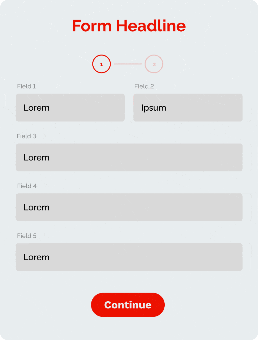
3. Consider a Multi-Step Form
If you need to collect extensive information, create a multi-step landing page form instead of asking users to fill out all information simultaneously. A multi-step form breaks up longer forms into multiple steps. To make the process even more seamless, set up the form to include touch elements so users can simply click an option or “Select all that apply.” You can then scale the form to ask progressively more involved questions, such as personalized comments.
4. Show Benefits
Clearly illustrate what users will gain by filling out the landing page contact form. The goal is to obtain contact information to nurture those leads, but users who want to know how your product or service will help them will ask. By demonstrating the value of your product or service and how you can help solve a problem, users are more likely to take action to learn the next steps.
Whether it’s signing up for a free sample, demo, sales consult, or medical study, it’s important to highlight these incentives to reel users in from the get-go. Create a sense of urgency by offering exclusive content for a limited time. Users will be less likely to ignore exciting opportunities relevant to their experiences.
5. Use a Strong CTA
The CTA should stand out and use action-oriented language to inspire immediate action from the user. From the design to the copy, the CTA must match the specific products or services you offer and displays correctly across devices. The copy should be direct, engaging, and communicate the value of filling out the form. Examples include: “Schedule Demo,” “Get Free Sample,” or “Request a Free Consultation.”
Moreover, the form’s design should direct attention to the CTA by using visually appealing, striking colors, text, and font size while reflecting your brand’s design standards.
6. Add Info Boxes
Info boxes are indicated by the “i” symbol above a field. Users can read helpful information that offers greater clarity when they click or hover. Adding these boxes can enhance the user experience by immediately answering common questions users may have about specific fields or a company’s product or service.
7. Prioritize a Mobile-Friendly Design
Ensure your landing page and form are fully responsive and user-friendly on mobile devices. Many users scroll for information on their mobile devices, making it crucial to create a mobile-responsive website to offer a seamless experience. The landing page and form should look professional and work efficiently on all devices. Features like a touch tap and geolocation can significantly reduce friction, so you don’t lose valuable leads.
8. Implement Smart Form Fields
Automate the process by filling in data based on users’ previous responses. Smart form fields include the user’s name, email, phone number, and organization. Users can enjoy a more effortless, personalized experience by enabling a browser autofill option.
9. Replace Typing
When optimizing content, visitors prefer engaging with touch elements such as images, buttons, or sliders to fill out forms over typing information. Replacing manual typing fields will create more straightforward navigability, especially on mobile devices.
10. Limit Pop-up Forms
Pop-ups deter visitors by hiding your hero form behind the CTA button. If the hero form keeps popping up when visitors try to view the page, they’re more likely to opt out. Instead, allow a persuasive CTA to catch the user’s attention before they engage with the hero form.
11. Highlight Error Messages
It’s challenging to track errors if the error message appears at the top or bottom of a page. Alternatively, highlight the error instantly when the user inputs incorrect information to ease friction.
12. Include an Email Verification Checker
Typos on forms can significantly impact lead captures, wasting both the marketer’s and the user’s time. An email verification checker tool can flag typos by reviewing an email address to ensure the domain is valid and the email syntax makes sense. This automated feature will give you better insight into your conversion rates and lead to a better user experience.
13. Simplify Form Validation
While preventing malicious activities is important, form validation can hinder the user experience when it becomes too complicated. For instance, consider replacing CAPTCHAs by designing hidden fields on the back end that spam bots can detect and then block submission if the hidden field is completed. This allows users to submit forms with ease while impeding server attacks.
14. Integrate Tracking and Analytics
Track form submissions with analytics tools like Google Analytics. Make informed decisions on optimizing your landing page and form to boost conversion rates. Analytics tools help you to understand user behavior to see which elements or fields are working and what needs to be fixed (i.e., why users are having trouble completing certain information or spending more time on certain fields).
15. Try A/B Testing
A/B testing will help you identify which elements are working and which need to be refined to increase performance. Testing different elements such as the headline, form fields, design of the form, and CTA enables you to optimize the page to improve user experience and raise conversion rates. By running two versions of the page simultaneously, you can track which page performs better to polish your marketing efforts.
Conclusion: The Ideal Landing Page Form Will Increase Leads
By implementing these form design best practices, you’ll create a form that effectively engages your target audience, addresses their unique needs, and encourages valuable conversions. A well-designed form with user-friendly features like clear instructions, logical layout, and real-time validation enhances user engagement. Ultimately, investing in these best practices maximizes the effectiveness of landing pages and will help you increase leads.
At Adfire Health, we work with healthcare marketers to create optimized, highly effective, data-based digital engagement strategies. With Thumbprint™, our segmented data ecosystem of over 8.2 million healthcare professionals, we can offer direct access to healthcare professionals nationwide.
We bring our years of hands-on experience to every new campaign and work with you to get the best results possible. Contact us to learn more about what we can do for your business.
Sources
- 101 Unbelievable Online Form Statistics & Facts for 2023. Word Press. Retrieved August 18, 2023, from https://wpforms.com/online-form-statistics-facts/.